Project #1: Self Portrait
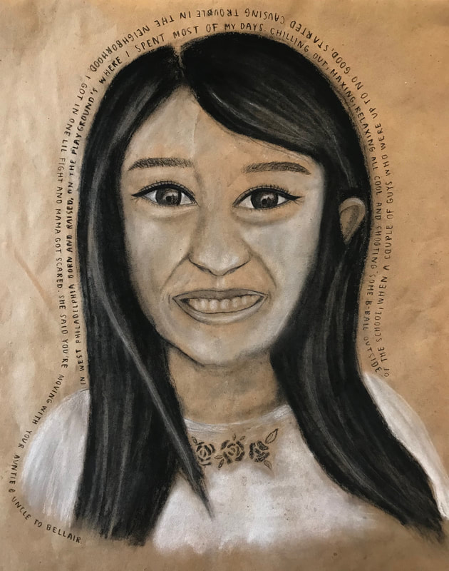
"Self Portrait", Completed on October 5th, 2018
1. Define which techniques you tried and mastered? Struggled?
Throughout the process, I think my use of value and lines were mostly successful, though I struggled with the grid and spacing, leading my portrait to look different than the picture.
2. How did you draw inspiration from other artists techniques or aesthetics in your work? In what ways did you derive meaning or gain historical perspectives from their work? Why these artists?
I didn't really look to other artists outside of my own class, though Ms. Oryan's example portrait was extremely helpful in guiding my use of white charcoal and value/ shading. I looked to other students' work in my class to be inspired and obtain new techniques for making my work more realistic.
3. Describe the evolution of your piece. Decisions made. Compositional elements.
The piece started out with a grid and a subsequent rough outline of my facial structure- completed in willow charcoal in case of later alterations. I then outlined my eyes, nose, mouth, and hair but later decided to make my eyes smaller as they looked too cartoony. Next, I finalized the placement of my facial features, added detail and begun shading them. I am happy with my use of value and highlights to create the illusion of a light source.
4. If you could consider doing something over, explain why you would do this and what you would do next time?
I would spend more time with my grid and spacing, because I think that would have made my work look more like me. Had I payed more attention to the placement of my eyes, for example, I would have made them slightly farther apart and made my hairline come up a bit. However, I am mostly happy with how the work turned out.
5. Elaborate on how this piece links with your other pieces? What is the common thread?
This piece relates to my still life drawing because it uses the same materials, and a similar texture of paper. Charcoal is sometimes tricky to draw with, but also results in amazing use of value, so I believe both pieces of work have shadows and highlights very well represented.
Project #2: my life rn
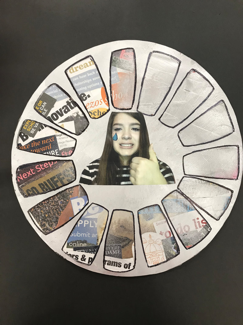
"my life rn", Completed on October 31st, 2018
1. Define which techniques you tried and mastered? Struggled?
The panel behind the loading symbol is a disk covered with a collage. I believe I mastered the collage, as it looks looks smooth, colorful, and vibrant even though it is partly covered by the cut out loading symbol on top of it. This was my first time using spray paint, so I struggled a bit with making it even and aesthetically pleasing. The goal was to creating the effect of "loading" through using more layers of paint in the middle, and having it fade out around the circle, which I feel like was achieved, though it looks slightly rough.
2. How did you draw inspiration from other artists techniques or aesthetics in your work? In what ways did you derive meaning or gain historical perspectives from their work? Why these artists?
For this particular artwork, I didn't really draw inspiration from specific artists, but rather the society that we live in, my life, and of course the theme of "Still Loading" (for the MCA Teen Art Show). I created the art to express my stress about college, careers, and my future in general.
3. Describe the evolution of your piece. Decisions made. Compositional elements.
I was always set on doing a collage for the background, but changed my mind several times when deciding what to put over it. Upon examining the theme, and the shape I had chosen for the collage, I decided that a loading symbol would perfectly fit the prompt, and look interesting. I then decided to use spray paint to make the cutouts look as if they were actually loading. After completing these steps, I printing and cut out a photo of me crying because I felt that the middle of the piece looked too empty and boring. I also enjoyed adding a bit of humor to the piece.
4. If you could consider doing something over, explain why you would do this and what you would do next time?
I would spend more time on outlining the cutouts of the top panel, and be more patient when the paint was drying. The outlines ended up looking kind of messy because many of them were done over drying spray paint.
5. Elaborate on how this piece links with your other pieces? What is the common thread?
This piece relates a lot to my self portrait, because both show the way that I view myself and my life. They are both very personal pieces where I use my face in different, but equally effective ways. More specifically, the piece fits with my theme of "Life, Death and Desensitization", because it shows the status of my life currently, and the sadness and stress I feel about my future. Additionally, I think the piece represents the desensitization of society towards teenagers as they go through the process of figuring out their future, because though it is is so commonplace, it remains an incredibly difficult process which can alienate people, as shown by the crying face trapped in the middle of my piece.
Project #3: Murder She Reef
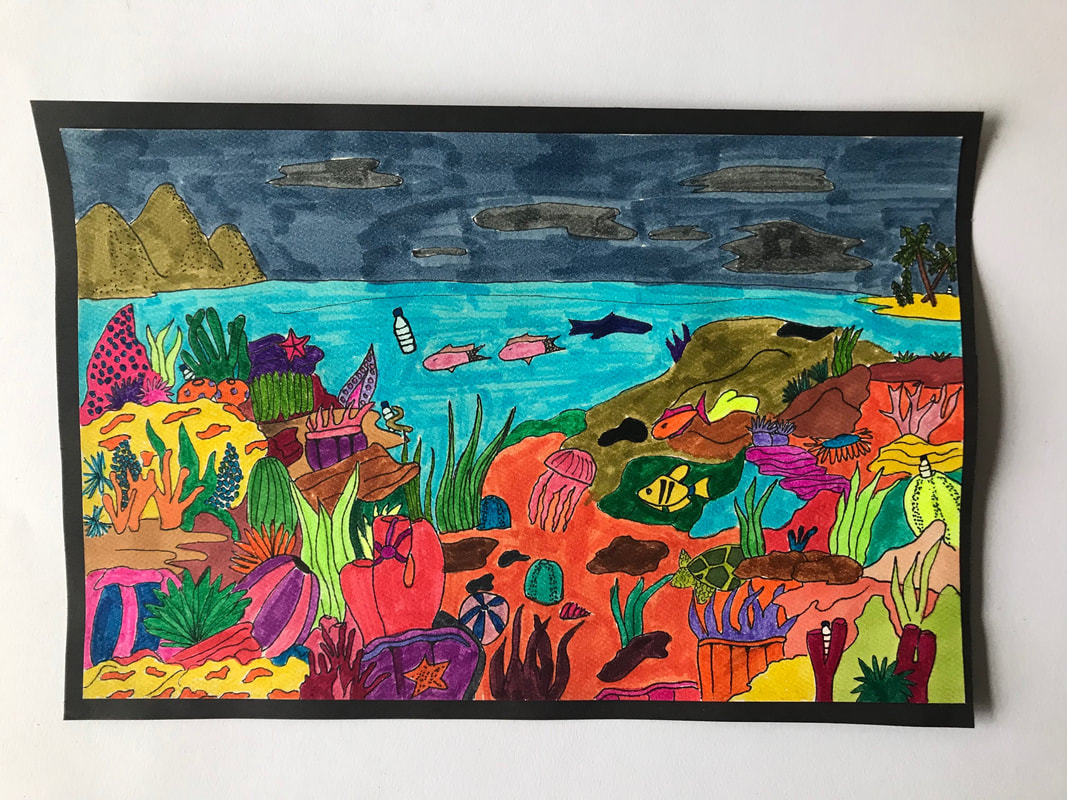
"Murder She Reef", Completed on November 7th, 2018
1. Define which techniques you tried and mastered? Struggled?
The goal of this work was to create a colorful piece with a more serious message (concerning the pollution of the coral reefs). Thus, I believe that my use of color made the work look eye popping and impactful. I used an array of bright markers to achieve this goal. In addition, my use of crisp, defined lines helped me to create clear shapes and perspective in my work. My main struggle was finding the balance between the cartoony theme that I wanted to achieve, and incorporating value within my work. Although my work was intentionally cartoony and one-dimensional, a lot of my struggle was caused by debating whether or not to use more value to make the piece look more realistic.
2. How did you draw inspiration from other artists techniques or aesthetics in your work? In what ways did you derive meaning or gain historical perspectives from their work? Why these artists?
My work was inspired by a digital piece done by artist Gerald Newton called "Amazing Coral Reef". I discovered this piece through randomly looking at coral reef art for inspiration, but it ended up providing me with a lot of ideas for underwater sea creatures and plants to draw, as well as colors to incorporate into the piece. Though I took a lot of liberties with my piece which led it to differ from Newton's work, the basic idea of the crowded and eccentric reef was derived from his piece.
3. Describe the evolution of your piece. Decisions made. Compositional elements.
I made the choice to use pen and markers in the piece because I wanted it to pop and appear busy yet beautiful. I felt that the pigmentation in markers could achieve this, and I'm happy with how the colors turned out. I decided to include minimal amounts of value because I wanted the piece to be cute and cartoony rather than realistic. Lastly, I decided to include several hidden plastic bottles to make a subtle statement about the devastation of pollution in the reefs.
4. If you could consider doing something over, explain why you would do this and what you would do next time?
If I could redo the piece, i would like to make it larger and more complex. I enjoy drawing the little details and hidden creatures, and I would have liked to include more on a larger paper. Additionally, I would have spent more time on making my marker strokes even. I think that the piece looks a bit amateur simply because the marker work is a bit sloppy.
5. Elaborate on how this piece links with your other pieces? What is the common thread?
My theme is "Life, Death and Desensitization", and this piece deals with all three aspects. Like my previous piece, this piece addresses the concept of life, by displaying a colorful and diverse ecosystem of sea life and plant life. The coral reef is a perfect place to observe life in all of its beauty and complexity. However, the piece also incorporates death and destruction through the theme of pollution and the subtle plastic bottles seen throughout the piece. I am trying to assert that even small levels of pollution can have catastrophic consequences on life. The subtly of the bottles ties into the concept of desensitization, because it suggests that we often ignore or don't see the destructive nature of our actions which leads us to care less and less.
Project #4: Life/Death Coloring Book
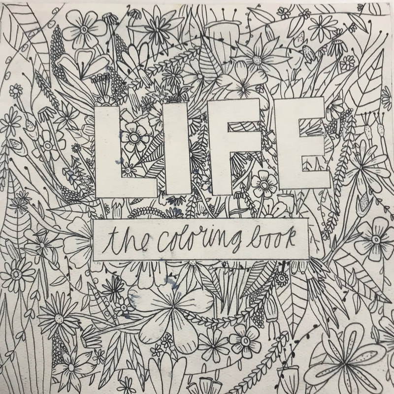
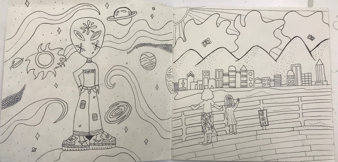
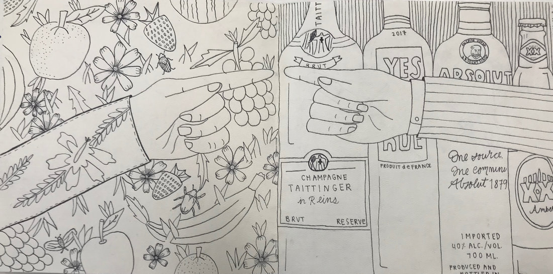
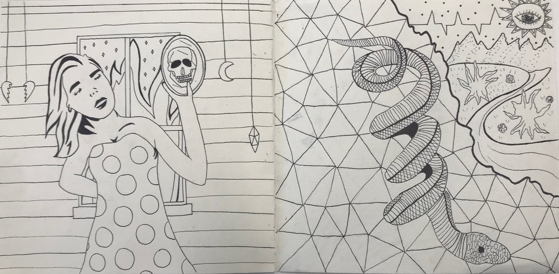
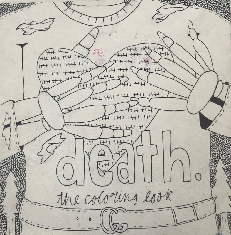
"Life/Death Coloring Book", Completed on December 10th, 2018
1. Define which techniques you tried and mastered? Struggled?
My piece is black and white, and very simplistic, so I believe that I mastered my use of lines out of necessity. I used one drawing tool throughout the entire piece (a fine tip Sharpie), so my utilization of varying thickness of lines was essential to providing dimensions and aesthetic value to the piece. The piece was intentionally cartoony, however I believe that I achieved a good amount of value, particularly when it comes to the mountains, clothing and body parts in the book, although I purposely did not attempt to make the work look realistic. In this particular piece, I had a very clear concept of what I wanted the piece to look like, so I really didn't struggle with any particular technique, however some of the pages lack clear direction. There isn't a clear focal point for some of the pieces, which is something I implicitly had difficulties with.
2. How did you draw inspiration from other artists techniques or aesthetics in your work? In what ways did you derive meaning or gain historical perspectives from their work? Why these artists?
I drew inspiration from various sketches I found on tumblr in order to think of concepts for the book. For instance, various pieces from artist Thomas Hooper (featured in his book "Inward") offered a lot of inspiration for creative additions in the book. A lot of the concepts of Cooper's work are dark, and deal with subjects like death, so the death section of my book was seriously aided by Hooper's ideas. Additionally, Hooper's work is primarily black and white, so viewing his work helped to create work with is interesting and dimensional without much value or color.
3. Describe the evolution of your piece. Decisions made. Compositional elements.
I made the decision to make my work crowded and colorless because the goal was to emulate a coloring book which would be interesting to look like, while also having the capability to be interactive through coloring. The decision to create a "book" rather than a singular piece, was because I think that a continuous piece can show the progression and relationship between life and death. I wanted to convey that the alive world literally mirrors the world of death, which is why I included a piece in which life and death almost become one. I created two cover pages, because I wanted the book to be looked at from either side/direction (life or death). I wanted to make the piece have a cartoony style, because it is meant to be like a child's coloring book, rather than an intricate, realistic piece with a lot of value.
4. If you could consider doing something over, explain why you would do this and what you would do next time?
If I could recreate the piece, I wouldn't change anything about what I've already done, though I would like to add more to it. In order for the piece to be like an actual coloring book, it should have more pages and intricacies than what I have already done. If not limited by time, I would have like to add five or so more pages to develop the themes of life and death more, and to create more opportunities for the piece to be interactive!
5. Elaborate on how this piece links with your other pieces? What is the common thread?
The piece directly relates to life and death, because it not only features scenes from both themes, but shows how they relate. Life and death are often seen as polar opposites. However, similarly to my coral reef piece, I am showing how life and death can operate together, and almost melt in to one another. The point of putting both life and death in the same coloring book was to convey the message that there is a fine line between them, and that they are related in a lot of ways. The piece is meant to desensitize the user, because it resembles a child's coloring book, while featuring dark and difficult themes involved with life and death. It is a bit of a confusing and unique medium with which to discuss such serious topics, which is exactly the point.
Project #5: No One Is Illegal! (Social Justice Piece)
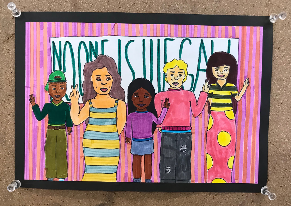
"No One is Illegal!", Completed on January 12th, 2019
1. Define which techniques you tried and mastered? Struggled?
When I saw that a social justice piece was a required project for the class, I was immediately excited, because I feel that art has a unique capability to convey strong messages regarding our society in an ambiguous way. My style tends to lean more towards cartoons than realistic work, so I was drawn to the idea of representing my piece in a cartoon-like style in order to make the piece sort of cute and aesthetically pleasing, while also making a strong assertion about social discrepancies. Therefore, I feel that my use of color was completely mastered in this piece, because color was the main point. Not only the varying skin colors of the individuals I drew, but also the colorful background and clothes presented, because they allowed the piece to be happy and celebratory rather than sad, which was the point of the piece. I also think that I mastered the use of space in the piece. Lining up all of the people featured side by side allowed me to assert that all people, in spite and because of our differences, are equal. As per usual, I struggled with the use of value. Small uses of value can be found on some of the people's faces, though it isn't strongly featured in the piece. This is because I am often conflicted between using too much or too little value in cartoon pieces. I hope to improve this skill throughout the remainder of the semester.
2. How did you draw inspiration from other artists techniques or aesthetics in your work? In what ways did you derive meaning or gain historical perspectives from their work? Why these artists?
Admittedly, the idea for my piece arose from a lot of research and inspiration. Primarily, I looked to artist Ashley Lukashevsky's social justice pieces for inspiration. Lukashevsky's work uses primarily cartoon figures of various ethnicities, body types, genders, etc. to make colorful, quirky and generally cute pieces which also hold a lot of weight. For instance, my piece was inspired by Lukashevsky's piece entitled "Nobody Is Forbidden" which featured three diverse individuals looking out at the State of Liberty. It also bore a number of flowers and bright colors which made the piece aesthetically pleasing, but also have a clear message about superfluous and unfair immigration reforms. In this way, I felt that her work served as a big inspiration for my piece, which incorporated a similar style and message.
3. Describe the evolution of your piece. Decisions made. Compositional elements.
The only concept I had in mind when I began the piece was that I wanted it to be about diversity and immigration. However, I made the choice to make the piece colorful and a bit ambiguous, with the words "No One is Illegal!" being barely readable. This is because the piece is meant to inspire hope and acceptance rather than make the viewer feel sad or guilty. I also chose to have a sort of uniformity (in having every character hold up a peace sign), because I wanted to convey the implicit message that people off all backgrounds and appearances can come together to inspire peace, and that we are all equal.
4. If you could consider doing something over, explain why you would do this and what you would do next time?
The piece turned out exactly how I wanted it to. However, if I were to re-do the project, I would consider expanding it. I would like to make the piece larger and include more people and details. I feel that the piece could be more effective and aesthetically pleasing if it was larger.
5. Elaborate on how this piece links with your other pieces? What is the common thread?
My theme is "Life, Death and Desensitization", and I feel that this piece deals with all three aspects of that theme. Firstly, human rights are closely intertwined with both quality of life and the threat of death. We live in a time period in which history is repeating itself. Minorities face discrimination and violations at every turn which serves as a threat and fear for one's life and wellbeing, while also making death a real and omnipresent possibility. Secondly, I often hear people say that they no longer watch or pay attention to the news, because it is too upsetting or too repetitive, which speaks to society's desensitization to modern day issues. I feel that the piece serves as a reminder for those that are turning a blind eye to race/immigration issues, that being informed and alert is the best way to tackle injustices.
Project #6: Face Behind the Glass
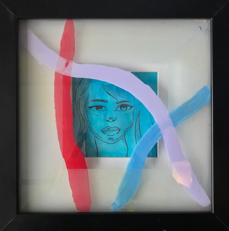
"Face Behind the Glass", Completed on February 1st, 2019
1. Define which techniques you tried and mastered? Struggled?
Once again, my piece is a lot more cartoony than realistic, but I feel that I effectively used value in this piece, even in a less-than-realistic way. I wanted to create the effect of a comic book, so I used a series of lines where the shadows would be on the face. I really enjoyed the effect of this technique, because I think that it includes value and dimension, while also maintaining the cute, cartoony look that I desired, as the piece is not meant to look realistic. Continually, I feel that I effectively used color within the piece because that was the main goal of the piece, and something I very heavily focused on. I wanted the face behind the glass to be monotone, because it is meant to convey sadness and convention. However, the three bright lines on the glass are meant to contrast the uniformity behind it. The color is clean and pops in the piece, which I believe was a big win. Although color was one of the strengths in the piece, I also struggled with it because glass is a new medium for me. I struggled with making the color opaque and clean from a frontal view. I am not super familiar with different types of paint, so creating bright color was certainly a challenge for me.
2. How did you draw inspiration from other artists techniques or aesthetics in your work? In what ways did you derive meaning or gain historical perspectives from their work? Why these artists?
My piece was inspired by two amazing female artists: Dorian Lynde and Polina Bright, respectively. I first came across Lynde's work when researching artists for my comparative study project, and was immediately attracted to her medium of painting on glass, because the pieces looked very clean, and in my opinion, a lot more interesting than regular painting on paper. Lynde's pieces also primarily focus on the challenges and struggles of women, through portraying Disney princesses, which I think offers a unique and powerful message. The concept of painting a women literally behind glass speaks a lot to societal barriers and burdens of women, which is something I tried to emulate in my piece. Though Lynde inspired the glass aspect of the piece, artist Polina Bright served as the inspiration for the comic-style of the drawing within the frame. I discovered Bright's work through social media, and was interested in it because it was able to incorporate both cartoony aspects, as well as value. I have struggled with the balance between the two for many of my pieces, so Bright's use of lines as value was something I tested out for the first time in this piece. Bright's work is meaningful in that it also focuses on the intricacies and beauty of women, which is a large part of my piece.
3. Describe the evolution of your piece. Decisions made. Compositional elements.
I began the piece with a simple sketch of a woman's face (using pen), but decided to incorporate the painted glass aspect to make the piece more interesting and meaningful. I then water-colored the drawing and began playing around with the painted lines on the glass. Fortunately, paint can be pretty easily scrubbed off of glass, so I was able to test out a lot of different types of lines, as well as their placement. Initially, I drew lots of thin lines crazily across the glass, however many of the lines prevented the background drawing from being seen. Additionally, I learned to add multiple layers of paint to each line, because many of the lines were completely see-through with only one layer of paint. I feel that having three, thick lines, allowed them to stand out but also keep the main focus on the drawing in the background.
4. If you could consider doing something over, explain why you would do this and what you would do next time?
I chose the first frame that was made available to me because we have limited resources in the classroom, and although I am satisfied with how the piece turned out, I would have liked to work with a bigger frame/bigger piece of glass. I feel that the piece would be more interesting and aesthetically pleasing if it was at a larger scale. This would also allow me to add more colors of lines. In addition, I would like to use a more opaque type of paint on the glass because adding multiple layers of paint was effective, but made the piece look slightly less clean. The ability to create a pigmented line with only one stroke would allow the piece to look more seamless.
5. Elaborate on how this piece links with your other pieces? What is the common thread?
This piece uses colors and glass to make commentary about the burdens of life. Colors can be an effective way to communicate emotions through art, while still maintaining some ambiguity about the artist's message. The point of the different colored lines is to express the different overwhelming emotions of the woman in the drawing. Coupled with the glass, and the blue color of the face, the piece attempts to convey how the overwhelming emotions of life can be isolating, and can lead to feelings of being trapped (like the woman is trapped behind the glass). In this way, the piece very directly speaks to "Life, Death, and Desensitization", because it offers commentary on the stress and burdens of life, and how that can lead to unhappiness.
Project #7: Pollination
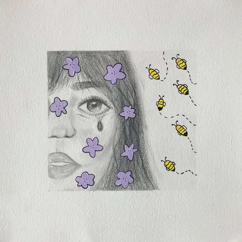
"Pollination", Completed on February 12th, 2019
1. Define which techniques you tried and mastered? Struggled?
Admittedly, I completed this particular piece pretty quickly, but was ultimately fairly satisfied with the results. The goal of the piece was to test out a bit of realistic-style drawing, coupled with the cartoon-like style of work that I most enjoy, and also feel most comfortable doing. I think that my use of lines, shading, and color allowed the face to look complete and realistic, and allowed the brightness of the yellow and purple paint to pop against the monotone background. I purposely used gray, plan pencil, and a bit of charcoal, to allow these colors to contrast one another. As always, I feel that I struggle with value. Although I am satisfied with how the face turned out, I still think parts of it could use more shading and detail to add greater dimension.
2. How did you draw inspiration from other artists techniques or aesthetics in your work? In what ways did you derive meaning or gain historical perspectives from their work? Why these artists?
To be completely honest, this piece arose from some random sketching without any particular roadmap for where it would go. I did not do any explicit research and therefore did not seek any external inspiration for this piece. It is possible that I implicitly drew inspiration from others, though it would be impossible to narrow down a specific source. I constantly look at art on social media and in my day-to-day life, and feel inspired by the work that I see, so it is probable that pieces of my work were inspired by other artists I have come across.
3. Describe the evolution of your piece. Decisions made. Compositional elements.
In my previous piece I sketched a woman behind a painted glass frame, and because I enjoyed that piece so much, I decided to draw a version of the same woman. In particular, I decided to draw a woman because I can better relate to the life and struggles of women. I decided to draw the face in black and white because I wanted it to represent sadness and solemness, and for the flowers and bees to stand out in comparison. I used acrylic paint for the flowers and bees because the color is far more pigmented than marker or colored pencil.
4. If you could consider doing something over, explain why you would do this and what you would do next time?
Though I am completely satisfied with this project, I would like to have made it on a larger scale. If not limited by time, I would have created several similar panels (perhaps with different colored flowers, or different kinds of bees) and placed them side by side in my exhibit. In this way, rather than do something over, I would very much like to extend what I’ve already done, and make it a piece with multiple components.
5. Elaborate on how this piece links with your other pieces? What is the common thread?
In this piece, the life, beauty and happiness of the woman is represented through the colorful flowers on her face, while the bees are meant to signify the various aspects of society which take from her, and threaten her happiness and liveliness. The bees are meant to be like pests which attack the beautiful and carefree things about the individual, such as gender roles and societal expectations. The harmful effects of the parasitic aspects of society are seen through the visible sadness and pain on the woman’s face. With respect to my theme “Life, Death, and Desensitization”, the piece shows how parts of life can threaten one’s happiness. The project shows that, though life is often portrayed as a positive thing, and the direct opposite of death (which is associated with darkness and bad things) life can also be its own worst enemy, and carry similar characteristics to those associated with death.
Project #8: Coffee Still Life
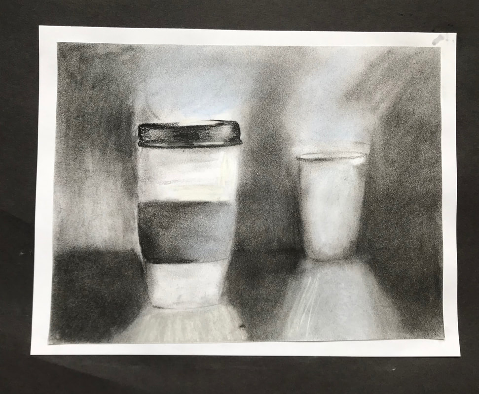
"Coffee Still Life", Completed on February 12th, 2019
1. Define which techniques you tried and mastered? Struggled?
Honestly, I really do not like this piece and only did a still life because it was a requirement. If you review any of my previous artist statements, you will notice that a common theme is my distaste for realistic drawings, because I prefer creating more cartoony pieces. That being said, although there were certainly techniques I used that turned out poorly, I was also satisfied with other aspects of the work, and all together enjoyed the challenge of a still life, which I hadn't done since the very beginning of the year. In terms of struggles, I feel that some of my lines, particularly those which signified the outline of each cup were too harsh, and not blended well. However, in terms of shading, particularly when it comes to the distinction between light and shadow, which allowed the piece to have a clear perspective and source of light.
2. How did you draw inspiration from other artists techniques or aesthetics in your work? In what ways did you derive meaning or gain historical perspectives from their work? Why these artists?
Though the piece was drafted from a physical set up I created myself, I was certainly inspired by artist Yim Mau-Kun's still life work. In particular, Mau-Kun's work was aesthetically inspiring because he primarily used charcoal as his medium, which is also the medium that I chose. Thus, his work gave me ideas for how to best use charcoal to create value and dimension for the piece. Yim Mau-Kun's work is historically significant and meaningful in that he is able to use a monotone, 2D medium to make images which come alive and jump off the page in a way which accurately and beautifully portrays artifacts from the past.
3. Describe the evolution of your piece. Decisions made. Compositional elements.
I decided to do a still life because it was a required project, but sought to draw something interesting that I enjoy. I decided to use charcoal because it is the only medium I am comfortable with for realistic, still life works. Additionally, I decided to use charcoal because it is extremely easy to blend and therefore easy to add value to the piece. Additionally, I chose to make the piece black and white because I wanted the focus to be on the value and dimension, and not bright colors.
4. If you could consider doing something over, explain why you would do this and what you would do next time?
I think my downfall was that I spent so little time on this piece. If I were to do it again, I would like to use more quality paper and spent time blending with the correct materials. I accidentally used some chalk and pastel rather than charcoal, which made some of the blending difficult, and the results streaky. Honestly, I think the piece could be remedied significantly through a couple extra days of work, and more care in selecting materials.
5. Elaborate on how this piece links with your other pieces? What is the common thread?
Many of my pieces offer deep and significant explorations into life and death, however this piece takes the phrase "life" quite seriously. I started drinking coffee about two years, and now when I don't drink it it truly feels like I am dead, as dramatic as that sounds. Although this is a mostly comedic connection, parts of it do carry deeper meaning. Often we rely on artificial sources of life, like coffee, to keep us going, and thus relates perfectly to my theme, which incorporates both life and death.
