Completed on September 3rd, 2018
1. Define which techniques you tried and mastered? Struggled?
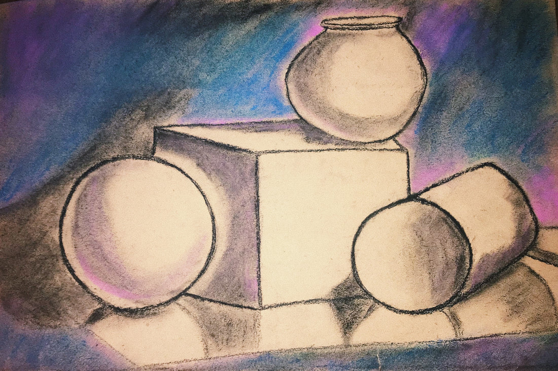
Throughout my drawing process, I used value, line, shape, color, direction, texture, and color. I feel that I mastered the use of color, as the blending of the blue and purple pastel in and around the shapes makes for a colorful and interesting work of art. I think I was sufficient at value, though I think I was lacking a bit in this area. Had I spent more time blending and shading perhaps my work would be a bit more realistic looking.
2. How did you draw inspiration from other artists techniques or aesthetics in your work? In what ways did you derive meaning or gain historical perspectives from their work? Why these artists?
Though I didn't look too much into the work of other artists for this piece, I was certainly guided by Ms. Oryan's example piece, and those posted on the walls around the room from previous students. However, I have seen several still life drawings from Vincent Van Gogh which gave me some inspiration because of his use of value and accurate/bold use of color which allowed the drawing to be aesthetically attractive, well proportioned, and realistic-looking.
3. Describe the evolution of your piece. Decisions made. Compositional elements.
The piece started out pretty simply- I used a grid on my paper to make my shapes evenly spaced and accurately proportioned. After that, I decided to make the lines concrete with the charcoal pencil so that the willow charcoal would no longer smudge. After that, I added value by shading the shapes to bring about a sense of light and shadow. Next, I made the choice to add color because I wanted the background to be interesting to look at.
4. If you could consider doing something over, explain why you would do this and what you would do next time?
I would spend more time with value and blending, to make my piece look more realistic. I would also like to correct the quality of my lines, because they are rather thick and bold, which creates a harsher and less realistic look.
5. Elaborate on how this piece links with your other pieces? What is the common thread?
This is my first piece of the year, so it doesn't relate to anything yet!
1. Define which techniques you tried and mastered? Struggled?
Throughout my drawing process, I used value, line, shape, color, direction, texture, and color. I feel that I mastered the use of color, as the blending of the blue and purple pastel in and around the shapes makes for a colorful and interesting work of art. I think I was sufficient at value, though I think I was lacking a bit in this area. Had I spent more time blending and shading perhaps my work would be a bit more realistic looking.
2. How did you draw inspiration from other artists techniques or aesthetics in your work? In what ways did you derive meaning or gain historical perspectives from their work? Why these artists?
Though I didn't look too much into the work of other artists for this piece, I was certainly guided by Ms. Oryan's example piece, and those posted on the walls around the room from previous students. However, I have seen several still life drawings from Vincent Van Gogh which gave me some inspiration because of his use of value and accurate/bold use of color which allowed the drawing to be aesthetically attractive, well proportioned, and realistic-looking.
3. Describe the evolution of your piece. Decisions made. Compositional elements.
The piece started out pretty simply- I used a grid on my paper to make my shapes evenly spaced and accurately proportioned. After that, I decided to make the lines concrete with the charcoal pencil so that the willow charcoal would no longer smudge. After that, I added value by shading the shapes to bring about a sense of light and shadow. Next, I made the choice to add color because I wanted the background to be interesting to look at.
4. If you could consider doing something over, explain why you would do this and what you would do next time?
I would spend more time with value and blending, to make my piece look more realistic. I would also like to correct the quality of my lines, because they are rather thick and bold, which creates a harsher and less realistic look.
5. Elaborate on how this piece links with your other pieces? What is the common thread?
This is my first piece of the year, so it doesn't relate to anything yet!
